

Assessment
- Discovery Sessions
- Conduct workshops to gather insights from stakeholders and understand the brand’s core values.
The Programme
Scene 01 · Curtain up
So your brand steps into the spotlight with a unique identity.
 Act One
Scene 02 · About us
At Teatro, we help you craft that story, where colors and shapes harmonize to form a unique identity.
Every project is a new scene, and we promise to deliver a show that exceeds expectations. We blend creativity and innovation so that each brand has its unique role on stage.
Scene 03 · Behind the scenes
Behind the scenes, we craft the visual language of your identity — transforming ideas into scenes and scenes into experiences that captivate your audience.
iiEvery great performance begins long before the curtain rises. In the hidden moments of creation, we script, shape, and direct the story your brand will tell on stage.
We see every design element as an opportunity to convey a strong visual message.
iiiScene 04 · Identity scene
We design the story that brings it to life.
Every color, every line, every light, plays its role in your brand’s story, designed to captivate its audience. Before the lights ignite the stage, we build the world your brand will inhabit, setting the scene for impact.
Drag the wheel to turn it
Scene 05 · Creative directing
Our methodology is akin to directing a well-crafted play. We start by defining roles, then coordinate ideas to create a harmonious performance.
Every step reflects professionalism, and we work to ensure that the final result is stunning, grabbing the audience’s attention and leaving a lasting impression.
Five frames · scroll to walk through
Scene 06 · Our approach
Lift a flap to read what happens underneath.
Scene 07 · Spotlight on creativity
We blend strategy, design, and technology to create unique identities that reflect the essence of brands.
We see design as a way to explore ideas and solve problems beautifully.
We use design to find better ways for people to experience brands simply.
31 services · 6 disciplines
Scene 08 · The scene dock
Every project is a new scene. Tip the front flat forward — or pick a tab — to bring the next one to the stage.
Brand identity
Sayah is a branding project focused on establishing a visual identity with a defined character. The scope covered logo direction, typography selection, color palette development, and key visual elements—then translated into core brand applications supported by an identity guide that sets presentation standards.
Corporate identity
Rasf is defined through a visual identity that reflects the brand’s nature and corporate presence. The scope covered logo direction, typography selection, color palette development, and key visual elements, then applied across core materials and various brand touchpoints for print and digital use.

Financial brand
Tam Capital focuses on building a visual identity for a financial brand with a confident corporate presence. The scope covered logo direction, typography selection, color palette development, and key visual elements—then translated into core brand applications supported by an identity guide.
Product & packaging
lim Water was developed as a branding project focused on building a product identity designed for strong presence. The scope covered logo direction, typography, color palette, and key visual elements—then translated into a complete packaging system including label design, information layout, and bottle application standards. The deliverables also included variations across sizes and an identity guide that defines print specifications and how the brand is presented on packaging and core materials.

Advisory firm
Lean Advisory establishes a visual identity for an advisory firm with a confident corporate presence. The scope covered logo direction, typography selection, color palette development, and key visual elements—then applied across essential corporate materials.
Service & operations
pIK is built around a strong, practical visual identity suited for service and operations-driven environments. The scope covered logo direction, typography selection, color palette development, and key visual elements—then applied across core materials and touchpoints.
Signature identity
Raskh establishes a visual identity with a strong signature. The scope covered logo direction, typography selection, color palette development, and key visual elements—then translated into core brand applications across print and digital use.

Defense solutions & training
Adwaa Namaa presents a visual identity tailored to a defense solutions and specialized training entity. The scope covered logo direction, typography selection, color palette development, and key visual elements, then applied across corporate and training materials.
01 / 08
Scene 09 · Visual scenography
Scenography is the art of creating worlds. We use colors and lighting to enhance messages and coordinate elements to form a cohesive scene.
Scene 10 · Our presence
200+
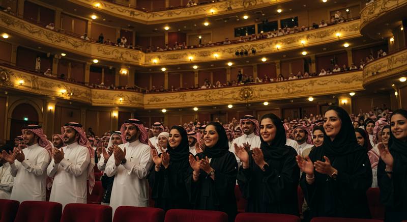
Stories that found their voice, and stepped onto the stage as brands.

18,000+
Visual identities designed, each playing a role within a greater scene.

30,000+
Pages and scenes shaped, forming worlds where identities live and perform.
Scene 11 · Curtain call
We prepare the moment before the lights rise.
Admit one
“here in teatro helps you craft that story, where colors and shapes harmonize to form a unique identity.”
Riyadh, KSA · Teatro Creative Agency